

Checkout decides if you get paid or get abandoned. You can run ads, rank on Google, and build a great product page, then lose the sale at the last minute because the checkout feels slow, confusing, or unsafe.
WooCommerce checkout optimization means you remove friction and doubts so more shoppers complete payment. You simplify fields, keep costs clear, add the right payment methods, and build trust without distractions.
This guide shows you what to fix first, how to use WooCommerce Cart and Checkout Blocks safely, and 10 WooCommerce checkout optimization ideas you can apply.
What is WooCommerce checkout optimization?
WooCommerce checkout optimization is the process of improving your checkout so more shoppers complete payment. You remove friction, reduce confusion, and build trust at the final step of the purchase.
Checkout vs cart
The cart helps shoppers review items and adjust quantities. Checkout collects details, confirms totals, and completes payment. Most lost orders happen at checkout because shoppers feel uncertainty right before they pay.
Fulfillment problems that show up at checkout
Fulfillment issues often appear as checkout issues because customers notice them in the total and delivery promise.
- Shipping cost feels too high or appears too late
- Delivery speed feels unclear
- Address fields feel hard to complete on mobile
- Payment fails or feels unsafe
- Return policy feels hidden or unclear
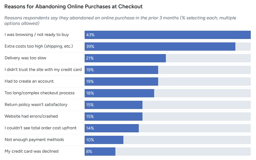
Why shoppers abandon checkout in WooCommerce
The leading reasons customers abandon their cart during checkout are:
- 39% extra costs too high,
- 21% delivery too slow,
- 19% did not trust the site with card info,
- 19% the site wanted account creation,
- 18% checkout too long or complicated,
- 15% returns policy not satisfactory,
- 14% could not see total cost upfront,
- 10% not enough payment methods.
Extra costs and shipping surprises
Extra costs drive the biggest drop off. 39% of customers abandon because extra costs like shipping, tax, or fees feel too high, and 14% abandon because they cannot see the total cost upfront.
Fix it with these moves:
- Show shipping and fees earlier in the flow
- Keep fees simple with clear labels
- Use one free shipping threshold only when margin supports it
Slow delivery expectations
21% abandon because delivery feels too slow.
Fix it with these moves:
- Show realistic delivery dates, not vague ranges
- Offer one faster option when you can fulfill it
- Make shipping upgrades clear and optional
Checkout feels long or confusing
18% of customers abandon because checkout feels too long or complicated.
Fix it with these moves:
- Remove fields you do not use
- Group fields in a clean order
- Add inline errors so shoppers do not guess
Trust and security doubts
19% abandon because they do not trust the site with credit card information.
Fix it with these moves:
- Keep the checkout header simple and distraction free
- Place returns and support details near the payment area
- Avoid sudden design shifts that make checkout feel unsafe
Forced account creation and login friction
19% abandon because the site wants account creation.
Fix it with these moves:
- Enable guest checkout
- Offer account creation after purchase
- Keep login optional and fast
Payment method mismatch
10% abandon because there are not enough payment methods.
Fix it with these moves:
- Offer cards plus wallets like Apple Pay and Google Pay
- Add local methods for your top regions
- Keep the payment area clean so shoppers pick fast
Check your current checkout before you change anything
Before diving into optimization, start by reviewing your current checkout flow. This section helps you measure and track performance so that any changes you make are based on real data, not guesswork.
A proper review helps you identify weak spots and measure improvements later. Tracking key metrics lets you see the direct impact of your optimization efforts.
Simple checkout health checklist
Run a quick diagnostic of your current checkout to identify pain points.
- Is the checkout process too long or confusing?
- Are there any unexpected costs or shipping surprises?
- Do customers have multiple payment methods?
- Can customers checkout as guests, or do they have to create an account?
- Are trust signals (security badges, return policies) visible?
- How fast does the checkout page load?
Checkout abandonment rate formula and what to track
Tracking the abandonment rate is crucial. Baymard’s cart abandonment rate formula is simple:
Abandonment rate = (Abandoned checkouts ÷ Initiated checkouts) × 100
What to track:
- Abandonment rate: How many customers leave before completing payment.
- Conversion rate: How many customers complete their purchase.
- Average order value (AOV): How much customers spend on average.
- Shipping and payment error rates: Monitor common issues that lead to abandoned carts.
Use WooCommerce Cart and Checkout Blocks the Right Way
WooCommerce Cart and Checkout Blocks are a modern approach to streamlining the checkout process. By using these blocks, you can easily customize the checkout experience without heavy coding, making it quicker and simpler for customers to complete their purchases.
When blocks are default and why it matters
WooCommerce Cart and Checkout Blocks are the default for newer stores (WooCommerce 8.3 and beyond). They offer a more flexible, customizable checkout process and are automatically set up in your WooCommerce store, making it easier to optimize the experience without needing plugins or complicated code changes.
If you’re using an older version of WooCommerce, you may still see the classic shortcodes instead.
Why it matters:
Using these blocks ensures better compatibility with newer themes, faster load times, and easier integrations with other WooCommerce features.
Compatibility risks and how to avoid missing payment methods
If you use Cart and Checkout Blocks, it’s important to check that all payment gateways are properly integrated. Incompatible plugins or outdated gateways can cause payment options to disappear or malfunction.
To avoid this issue:
- Make sure your active payment gateways support the block-based checkout.
- Test the checkout process after any plugin update to ensure payment methods still work.
- If there’s a compatibility issue, consider using WooCommerce’s classic checkout template or contact the plugin developer.
Store notices and shopper messages that reduce confusion
The Store Notices Block allows you to show important information directly within the checkout page, such as:
- Shipping deadlines
- Returns policies
- Discount codes or offers
Ensure this information is clear, concise, and placed near the most relevant checkout sections (like payment or review). You want to avoid overloading customers with information but still provide the most important details that can help them feel more confident about their purchase.
Also read: How to Start an Ecommerce Business: Step by Step Guide to 16% Growth
10 WooCommerce Checkout Optimization Ideas
The 10 WooCommerce checkout ideas are:
1. Remove unnecessary checkout fields
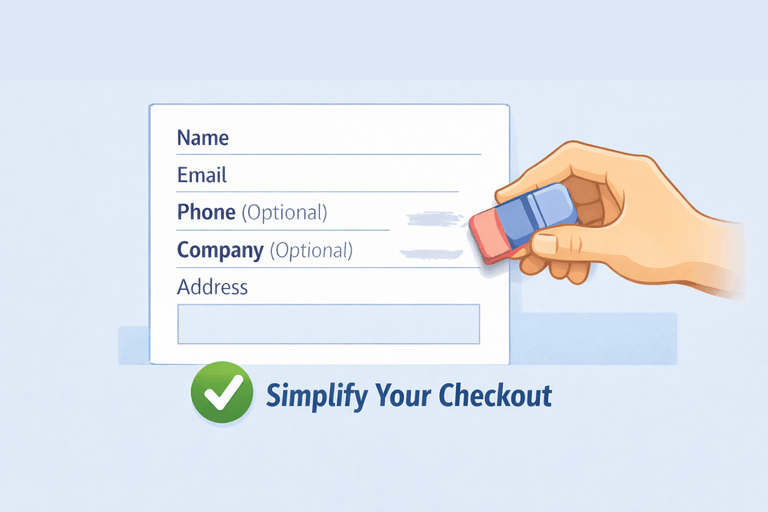
One of the simplest and most effective ways to optimize your WooCommerce checkout is by removing unnecessary fields. Every additional field at checkout is a potential point of friction that can drive customers away.
Start by reviewing your checkout fields.
- Do you really need to ask for a phone number?
- Is company information necessary for every customer?
Often, reducing fields like “company name,” “fax number,” or “secondary address lines” streamline the checkout process. Every field you remove should serve a clear purpose. Fields that don’t add value to the purchase experience are often the ones that slow customers down.
Here’s how to remove unnecessary fields:
- Go to WooCommerce > Settings > Checkout and disable fields you don’t need.
- Use plugins or code snippets to remove extra fields like company name or state (if you don’t ship internationally).
- Check customer feedback — sometimes customers feel frustrated when they have to enter too much data.
2. Enable guest checkout and simplify login
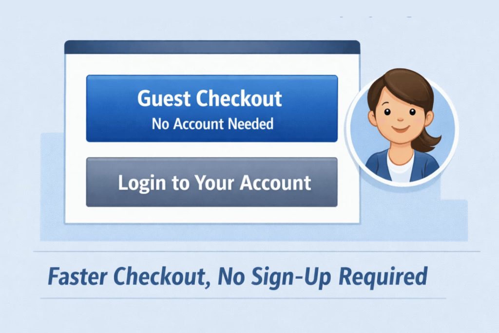
Forcing customers to create an account before completing a purchase is one of the biggest checkout obstacles. Many shoppers don’t want to go through the hassle of remembering yet another password or filling out a long registration form.
By enabling guest checkout, you allow customers to purchase items without creating an account, which removes friction at the critical moment of conversion.
Why guest checkout works:
- Saves time: Customers who just want to buy a product don’t need to waste time filling out unnecessary registration forms.
- Fewer distractions: By removing account creation, shoppers stay focused on completing their purchase.
- Better conversion rate: Studies show that nearly 30% of customers ghost their carts when forced to create an account. Offering guest checkout can help reduce this.
To set this up:
- In your WooCommerce settings, go to WooCommerce > Settings > Accounts & Privacy.
- Enable the “Allow customers to place orders without an account” option.
- Add an option for customers to register after the purchase is complete, so they can easily sign up if they want to track their orders or save their details for future purchases.
By giving your customers the option to check out as guests, you eliminate one of the top reasons for cart abandonment.
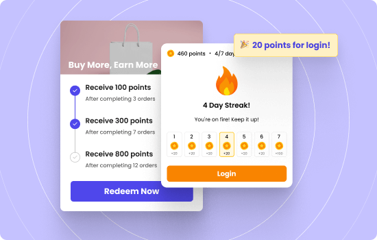
3. Show points earned and rewards progress to increase completion
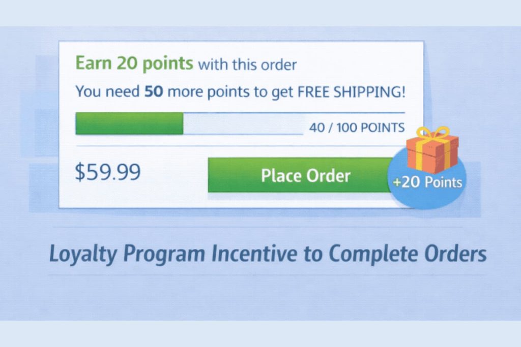
Loyalty programs are a great way to encourage repeat purchases. Showing points earned and rewards progress at checkout nudge customers to complete their purchase.
By displaying how many points customers are earning from their current purchase or how close they are to a reward, you add a layer of gamification that increases the perceived value of their cart.
Make the reward visible before payment.
- Show points earned from this order
- Show current points balance
- Show distance to next reward tier or redemption
Use simple, direct language.
- “Earn 250 points with this order”
- “You’re 100 points from free shipping“
- “This order unlocks Gold tier benefits”
- “You have a free birthday reward for this month”
Place progress where the shopper reviews the total.
- Near the order summary or subtotal
- Above or beside the place order button
- In a small highlighted box that stands out
Keep the message tight.
Shoppers respond when they see immediate benefit. If earning points from this order pushes them to a threshold, show it. If they are close to a reward, tell them how close. If the current loyalty tier unlocks something useful, name it.
Example: A coffee shop can show “Earn enough points for a free drink” when the order gets them there. A fashion store can show “refer a friend and get a $10 discount” when they hit the spending tier. An electronics store can show point balance and next reward value.
Increase your ROI upto 20X with WPLoyalty’s customized loyalty campaigns and reward your loyal customers this Valentine’s day.
4. Use a simpler checkout layout with fewer distractions
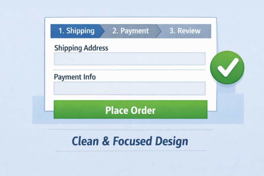
A clean and simple checkout layout can drastically reduce abandonment rates. Cluttered checkouts with excessive text, images, or links can distract and overwhelm customers, making them second-guess their decision to purchase.
Here’s how to simplify your checkout layout:
- Minimalist design: Use a clean, straightforward design that only includes the most essential information. Keep distractions to a minimum.
- Logical field order: Make sure the fields are ordered in a way that feels intuitive. For example, the address should come before payment details.
- Progress indicators: Use a progress bar to show customers how far along they are in the checkout process. This visual cue helps set expectations and reduces anxiety.
Impact: Reducing the visual clutter and making the process easy to navigate leads to a better customer experience. In fact, 43% of shoppers abandon carts due to a complicated checkout process.
5. Keep payment on site and reduce redirects where possible
Redirecting customers to external payment gateways adds unnecessary friction to the checkout process. It disrupts the flow, makes customers leave your site, and creates trust issues.
Keeping the payment process on-site ensures a smoother experience and increases the likelihood of conversions.
Why keeping payment on-site is important:
- Better control: You maintain a seamless customer experience without external interruptions.
- Improved trust: Shoppers are more likely to trust a site with an in-page checkout versus being redirected to a third-party page.
- Faster checkout: Shoppers won’t need to wait for external pages to load, making the process quicker.
To implement this:
- Use WooCommerce-supported on-site payment methods like Stripe, PayPal, or Authorize.Net.
- Avoid third-party redirects during payment by selecting payment gateways that support inline forms.
- If you need to use external gateways, ensure the design is consistent with your site’s look and feel.
6. Add upsells and cross sells at checkout
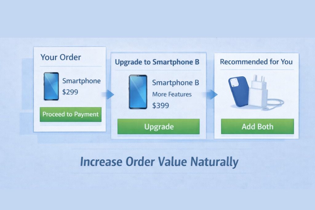
Upsells and cross sells work without interrupting the checkout flow. A customer reaches the checkout ready to complete the order, and you show them one product that makes the current purchase better or solves a problem they already have. They accept it when it fits. They ignore it when it does not.
The line between helpful and annoying sits at relevance and restraint.
Show products that relate to the current cart.
- Product protection for electronics
- Batteries for items that need them
- Matching accessories for clothing or gear
- Refills or consumables for the main item
Keep the offer small and clear.
- Show 1 to 2 products maximum
- Use images and short descriptions
- Show the price clearly next to the product
- Make the add to cart action simple, like a checkbox
Place the offer where it makes sense.
- After cart review, before payment
- In a distinct section that does not look like required fields
- Never between payment method and the place order button
Example: A camera store can offer a memory card when someone buys a camera. A supplement store can offer a second bottle at a discount. A tool store can offer drill bits when someone buys a drill. The product relates directly to what they already decided to buy.
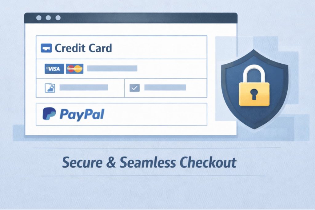
7. Offer more payment methods customers actually use
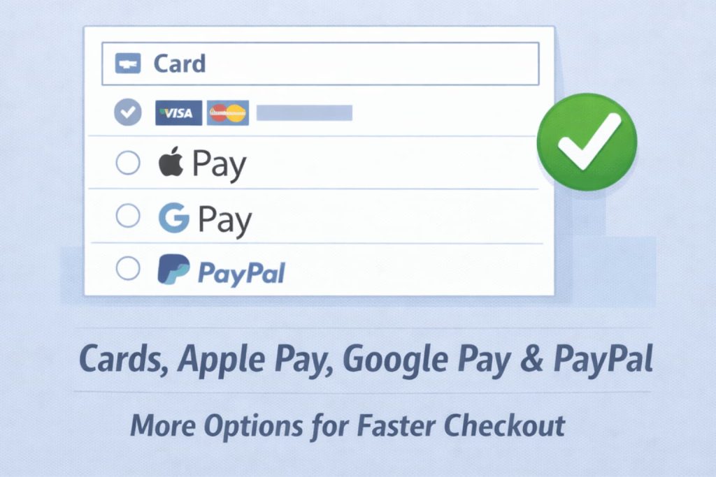
Payment choice decides speed. When checkout shows only one or two options, some shoppers stop because they cannot pay the way they prefer. You fix this by offering a small set of common methods, then adding local options only where they matter most.
Start with a core set that covers most orders.
- Card payments through your main gateway
- Digital wallets like Apple Pay and Google Pay for fast mobile checkout
- PayPal if your audience uses it
- A pay later option only if it matches your product and return policy
Digital wallets keep growing. Worldpay reports that digital wallets account for a large share of transaction value and they project wallets to stay dominant across ecommerce.
Keep the payment area simple so shoppers decide fast.
- Show 3 to 5 payment methods, not 10
- Put the most used option first
- Hide methods that rarely get used in your top countries
- Use clear labels like Card, Wallet, PayPal
Example: If most of your orders come from mobile, add Apple Pay and Google Pay and keep cards as a fallback. If you sell internationally, add one local method for your top region, then expand only after you see demand.
8. Make shipping costs and delivery speed clear before payment
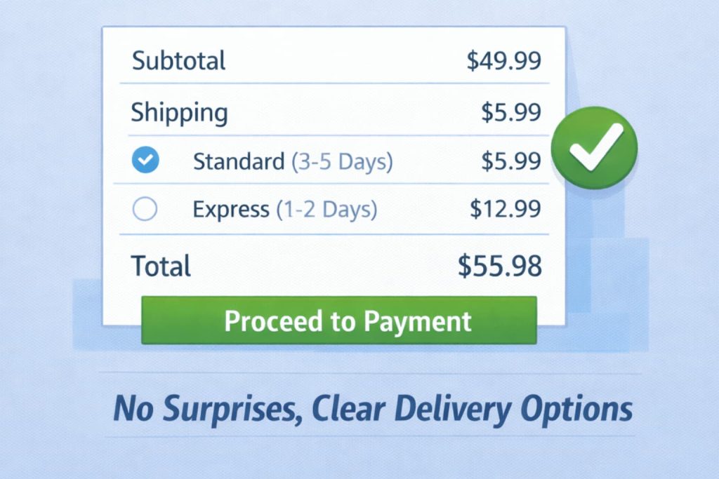
Shipping surprises break trust at the worst moment. Your shopper reaches the checkout ready to pay, then sees a new total, unclear delivery speed, or a vague shipping method name. That confusion causes drop off.
Show the full cost early and keep it easy to understand.
- Show shipping cost estimates on cart and checkout
- Use simple method names like Standard and Express
- Show delivery dates when you can, not only delivery speed
- Keep fees separate and clear so the total feels honest
Make the best option obvious.
- Default to the most common shipping method
- Offer one faster option only if you can meet it
- Avoid showing many similar rates that look like duplicates
Examples you can use:
- Standard delivery 3 to 5 days
- Express delivery 1 to 2 days
- Local pickup if you run a local store
If you offer free shipping, use a single threshold that protects margin. Show it before payment so the shopper does not feel tricked by the total.
9. Add trust builders on checkout without clutter
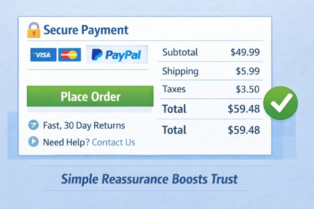
Trust signals work when they reduce doubt. They fail when they add noise. A crowded checkout makes shoppers pause, scroll, and rethink the order.
Place trust where the shopper needs it.
- Near payment: security reassurance and payment logos
- Near totals: clear taxes, shipping, and fees
- Near the place order button: returns and support link
Keep your trust set small and specific.
- Show a short returns line like 30 day returns
- Show contact options like email or chat
- Show delivery promise in one line
- Show secure payment message close to the card fields
WooCommerce also recommends a simpler checkout header with fewer distractions to keep customers focused on completing purchase.
Examples of trust copy that stays simple:
- Secure payment
- Easy returns
- Support available
Avoid repeating the same message in multiple spots. If shoppers see it once, they remember it. .
10. Add checkout add ons that customers choose
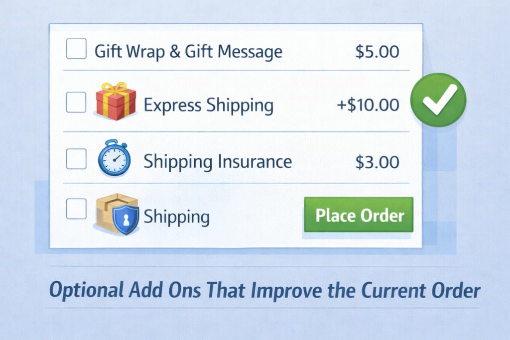
Checkout add ons increase order value when you keep them optional and relevant. Customers accept add ons when they understand the value and the choice stays in their hands. Customers reject add ons when they feel forced or when the add on looks unrelated.
Good checkout add ons share one trait. They make the current order better.
- Gift wrap and gift message
- Rush handling or faster shipping upgrade
- Shipping insurance for fragile items
- Order tip for service based stores
WooCommerce highlights add ons like tips, gift wrapping, rush handling, and gift messages as common checkout add ons customers can select during checkout.
Use a simple setup rule.
- Show only 1 to 3 add ons
- Use clear pricing next to each add on
- Default every add on to off
- Place add ons after shipping, before payment
Example: A gift store can offer gift wrap and a gift note. A high value electronics store can offer shipping insurance. A food store can offer a rush delivery upgrade. You keep add ons tight and relevant, and you raise revenue without hurting completion.
Turn smooth checkouts into repeat customers – reward every purchase automatically with WPLoyalty.

